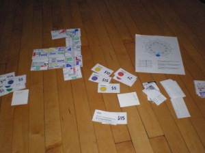
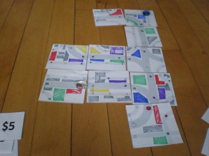
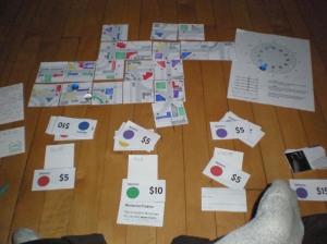
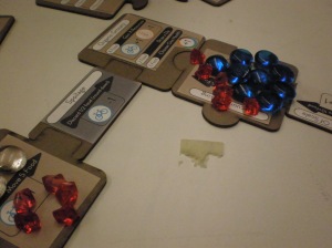
I’m working in a new board game. I’m pleased with how the first stage prototype is coming along, so I wanted to share! (click to embiggen)
Archive for the ‘Design Process’ Category
Early Stages of Mayhem
In Design Process, Game Design, Product Design, Sketches on March 30, 2012 at 1:16 pmIn Vino Veritas (Custom Wine Rack)
In Design Practice, Design Process, Product Design, Self-Reflection, Sketches on December 17, 2011 at 1:42 pmI have a little problem with ordering wine on the internet. I wish I could say that I’m a customer of discerning taste, but it’s more like I get coupons from totally unrelated purchases and figure that if I’m going to eventually drink 12 bottles of 10$ wine, I might as well get it delivered all at once and not have to shlep down to the liquor store every weekend.
At some point, I lost track of my purchases, and a couple different orders all came at once.
This, of course, demanded that I make a wine rack to hold these fine beverages in style. I think I have one more round of revisions to make to be totally happy, but this is the current solution:
Materials & Process: CNC machined .5″ baltic birch, blue wood stain (face) and Xact-2-Form .5″ cement form material (sides and back). Drawn in Rhino and Illustrator, cut with a custom Shopbot rig at my work. Machining time about 2 hours, plus another hour or so of sanding and finish. Pressure-fit slot construction, no fasteners or glue. Overall dimensions ~ 31″ wide x15.5″ tall x 8.25″ deep.
Full process, detail shots and more info after the jump. All images are click-to-embiggen-able.
What I’ve Been Up To
In Design Process, Game Design, Thesis Work on May 30, 2011 at 8:19 pmTaking a break. Here’s some behinds-the-scenes of what I’ve been working on (all pics are click-to-enlargeable)!
The show opens June 11th. Coming up quick.
Thesis Update: Just Work
In Design Practice, Design Process, Game Design, Product Design, Promo, Thesis Work on May 2, 2011 at 4:53 pmSince getting back from Milan, I’ve had to refocus on this whole thesis thing pretty hardcore. On the plus side, as the semester winds down (one week of classes left!), all of the other classes are slowly falling away. Soon, it’ll just be us and thesis, battle to the death, for about a month.
On the one hand, it’s going to be a lot of work, because I really, really want to have a quality final product for the show in June. On the other hand, at this point it’s “just” work. The games have started gaining that momentum where it’s becoming obvious which parts to let fall away, which fold into each other, and which feed the development of the next stages. This is the fun part (twitter whining notwithstanding).
To that end, photos!
I have my critique week critique in a couple of days, so most of my energy is going towards having some playable prototypes for that. Hopefully after I’ll have some kind of insighful analysis. Until then, pictures of rubber pants should suffice.
More pics after the jump.
Milan Proceeding Apace
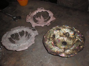
In Design Process, Milan, Product Design, Promo, Uncategorized on March 16, 2011 at 11:47 amUnfortunately, my video capability for my last (and I think final) dripcast was hamstrung by a collection of old batteries, none of which were capable of providing more than a minute of video at a time. But, in short, my casting guy figured out a solution to the keying-in problem, enabling us to separate the coin metal from the iron die without any problems at all! I was, in the end, able to cast one bowl out of $20 worth of nickels, and one out of $20 of quarters. In addition, I brought some plastic consumer goods to try. The polypropylene bowls didn’t really melt (they just burn away), but we had astounding, and weird, success with a $20 spindle of blank DVDs.
In addition, I cast $20 worth of sugar (which is a LOT of sugar, btw), and $20 worth of decorative candles (mmm, Fig+Patchouli).
Check out all the (many) pics after the jump!
Milan Sneak Peak
In Design Process, Milan on March 12, 2011 at 9:00 amWe gave a fairly informal presentation for the Advisory Design Council here at SAIC. The goal was to get some fresh eyes on our plans for the exhibition space and graphic elements, and we definitely got some useful feedback! In addition, we had all of our pieces laid out in their various states of finish. Everything here is still in process, but having it all out really made it feel like our show is starting to come together!
(all images shown here are under the aegis of the School of the Art Institute of Chicago, btw, and the work is technically property of the school. I’ll link to the show website once it is up.)
Milan Process – Failing Forward
In Design Practice, Design Process, Milan, Product Design on March 10, 2011 at 11:04 am
Things I Learned:
- I brought twice as much material as I had estimated I’d need. It ended up being barely enough to make one piece. Later, I was told the rule of thumb is bring at least 4 times what you think you need; if you waste half your material twice, then at least you’ll get one thing out of it.
- Molten metal behaves completely differently from any of my prototyping materials (wax, quick-setting plastic). It was really cute how I thought I could approximate it. It’s so much more dense and viscous even at it’s most molten (or at least it’s most molten we could achieve with the oxy-torch) that it didn’t flow the way I thought/hoped.
- This experimental casting process is totally experimental. I had hoped to get finished pieces; I barely got one kinda-sorta-prototype out of it.
- Not being able to actually do it myself is intensely frustrating, even when working with a really chill guy that is absolutely on board with making my crazy idea work.
- Sandcasting is NOT the process to use to make a precision die. The flaws in the iron surface gave the currency material plenty of opportunity to key in, making it necessary to chisel the material off the die. Extremely not ideal.
Also, the prototype itself really doesn’t have the attractive quality that I had hoped for. So, the idea is expanding and changing a bit – instead of casting different kinds of change ($2 of pennies, $2 of nickels, etc), I’ll be assembling the same face value of various goods as well ($20 of plastic toys, $20 of fine chocolate, $20 of aluminum foil, etc) and casting those over the die. Dematerialization and Rematerialization of value, indeed.
Read on for pics!
Process for Milan
In Design Practice, Design Process, Milan, Product Design on February 26, 2011 at 11:37 amIf all goes well, I should have final pieces within the week!
The project, called More Than It’s Worth, comes from consideration of the intangibility of currency in the modern digital networked world, and what other potential values of the physical totems of money we can find.
The final pieces will be the same amount ($2.00) worth of US currency, melted and drip-cast over a cast-iron die. Each bowl in the series is made of one type of coin (pennies, nickels, dimes, quarters and dollar coins), demonstrating the curious relationships between face, melt and aesthetic value of each.
Some pics of the plastic prototypes (the making of which is show in the video up top):








Pre-Final-Final Critique
In Commentary, Design Process, My Thoughts On, Self-Reflection, Thesis Work on May 6, 2011 at 11:07 amYesterday I had my Critique Week critique. Crit week, as we call it, is a pretty interesting feature of how SAIC works. Basically, the second-to-last week of each semester is given over to individual 45-minute critiques of each graduate students work by a panel of faculty and visiting artists. Classes are suspended and each student is assigned a day and time to present their work. In the fall you present to a panel of faculty drawn from the department you practice in, and in the spring it’s an interdepartmental panel. Mine, as it turned out, was moderated by a Printing faculty member, and included Film/Video/New Media, Painting, Sculpture and one Architecture instructor (who I had had in the fall for our CTA group studio project).
It went surprisingly well! The fear with these things is not just that it could go poorly, as in the panel doesn’t like or understand the work (that’s not really a big deal), but that it won’t be helpful in furthering the work. I worked pretty hard to get two games to a fully prototyped stage (pics forthcoming), and it really helped, even though we didn’t get into deign details. Having physical things to evaluate makes it so much easier to communicate the idea, every time. The tone of the panel was generally positive and complimentary, with specific questions about how to make the work more effective in really communicating food issues, and some solid suggestions for next steps to take. So it went well, and it was helpful – first time!
Some takeaway points about these critiques (gleaned from my experience and talking to my classmates):